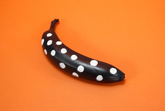
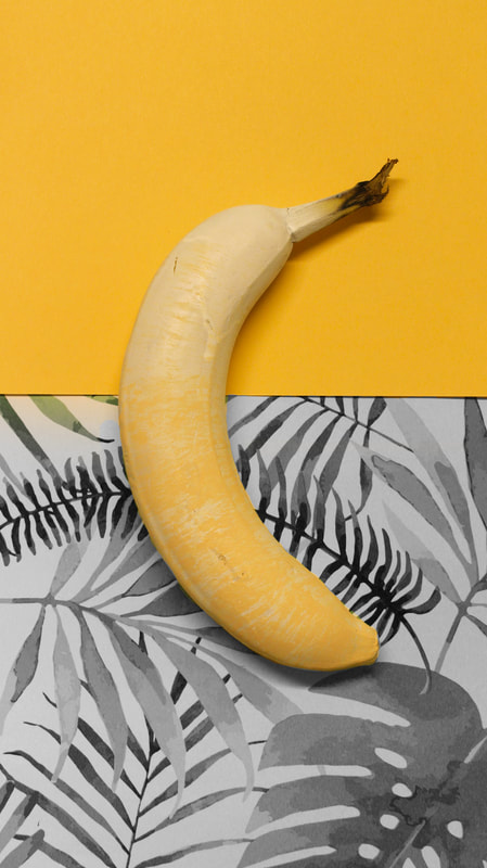
Banana.
Using a simple iconic shape and changing everything we know about it entices a viewer making them into a buyer.
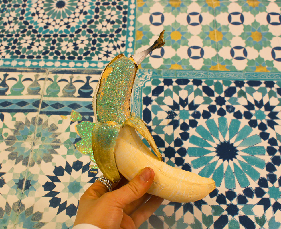
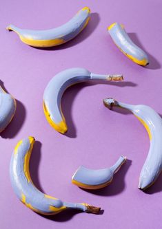
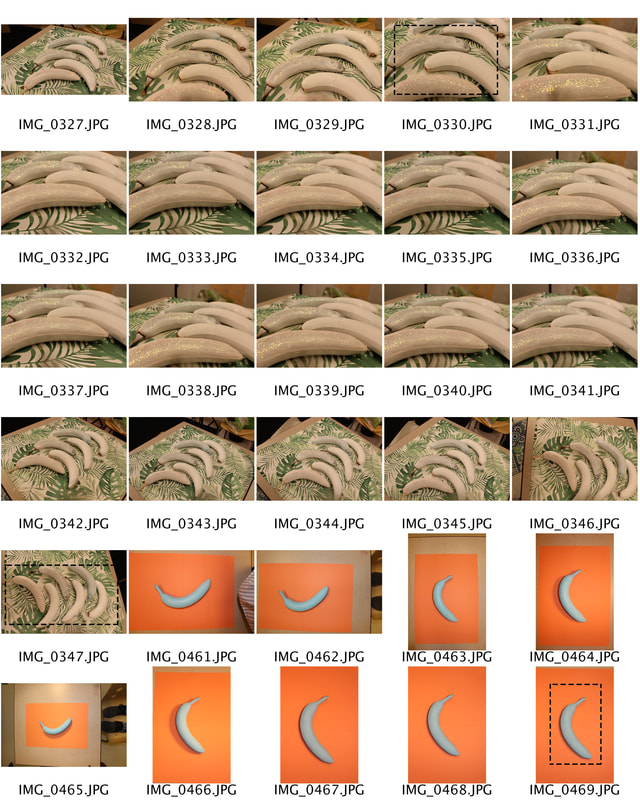
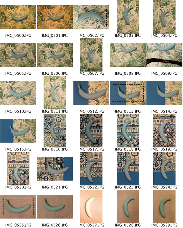
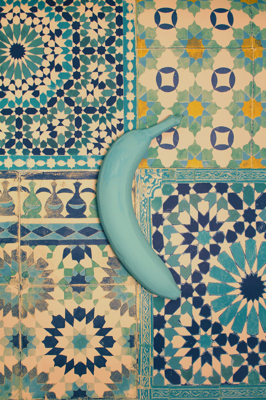
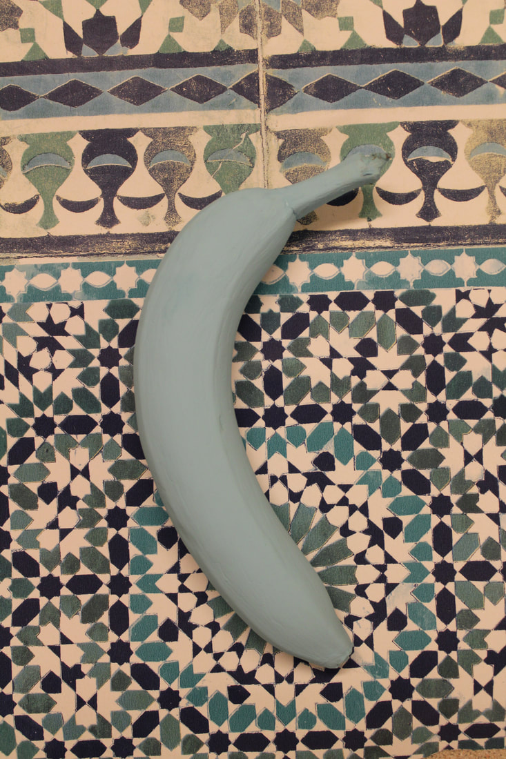
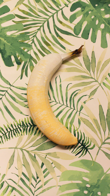
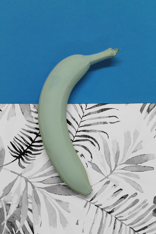
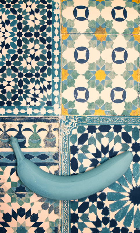
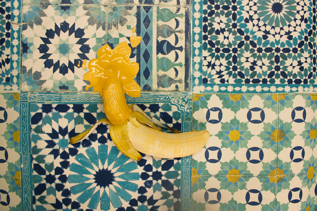
Shoot 6.
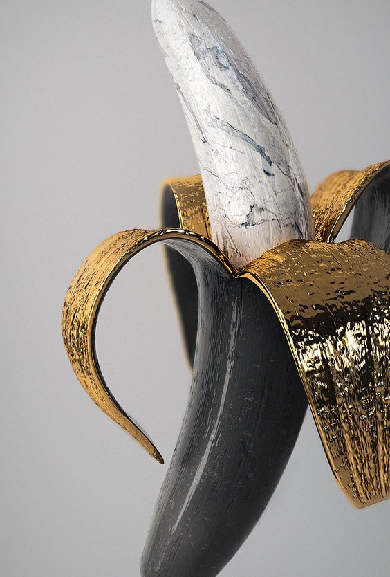
Inspiration.


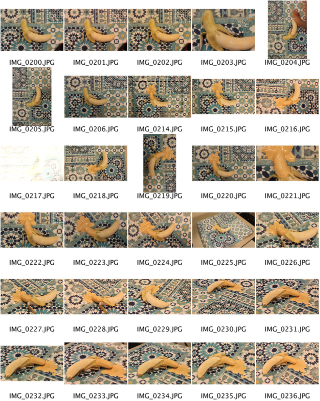
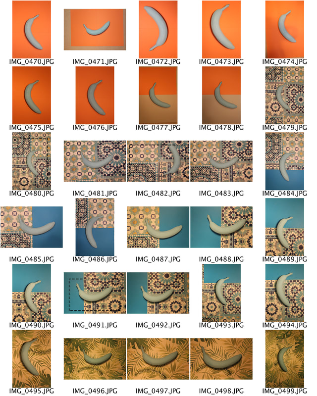
Contact Sheets.
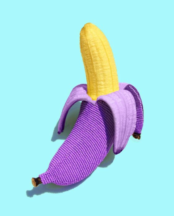
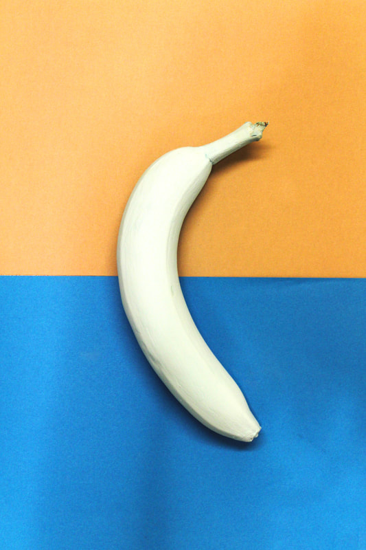
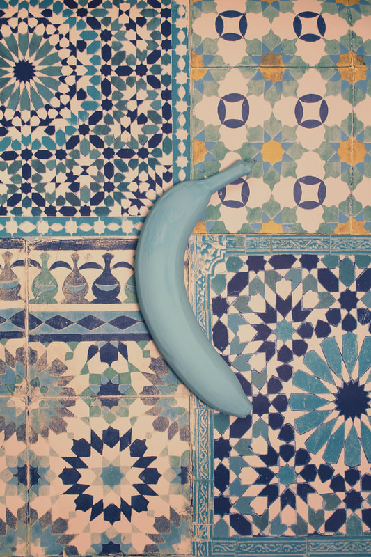
This shoot consisted of many backgrounds, many angles, many styles and many different colours. I very much enjoyed doing this shoot because I got to play around and have fun with all the many compositions.

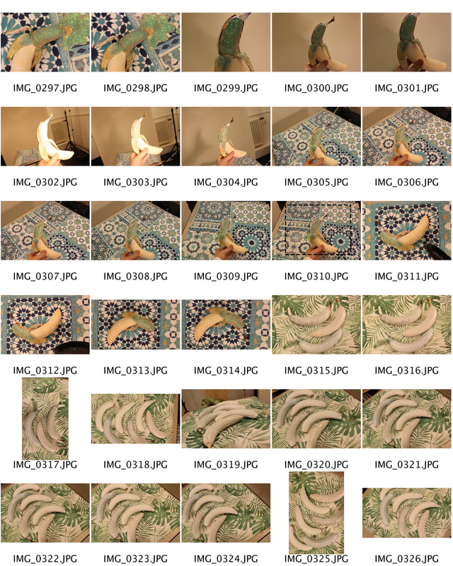


Extra.
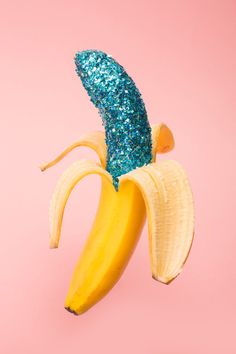
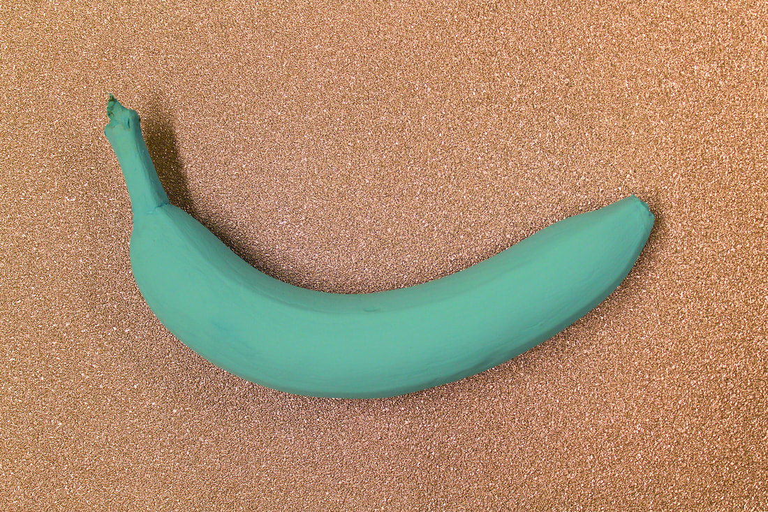
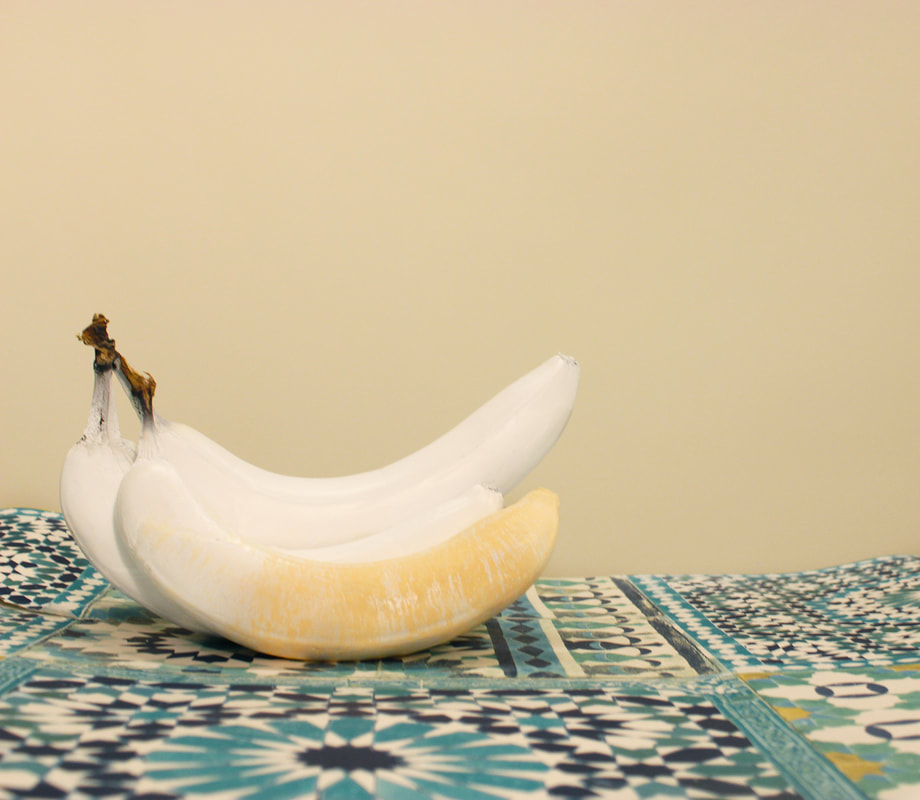
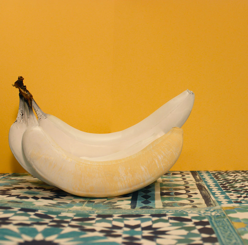
Before editing these images I chose them as the composition was good, however once I edited them I didn't like them because of the shadows, colours and glitter style.

Importance of editing in advertising.
It is very important to edit an image that's purpose is advertising. As a company you want your product to look the best, not unrealistic. Getting rid of little things like yellowing from lighting, and therefore making white actually white and not cream. It is very important to make the colours the ones they are meant to be, or otherwise the image looks unprofessionally shot as we all know a camera will adjust and change colours. Images that look unprofessional will not capture the viewer and therefore maybe lose that views trust.
Drawing the line at editing.
When editing the images you can go to far. Going to far with editing, making it obvious to a reader, this means you can lose the trust between the company and the customer.


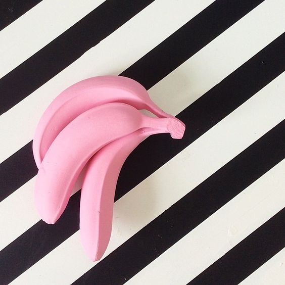
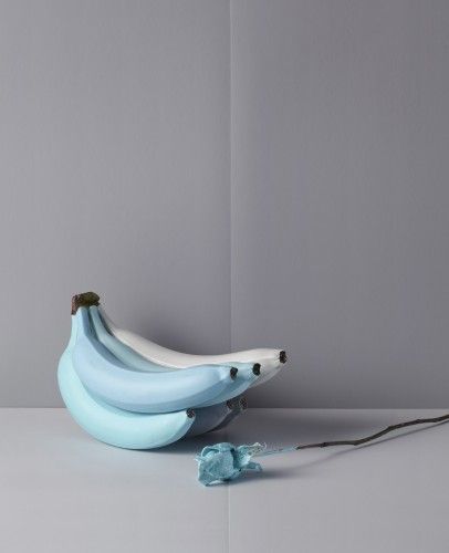
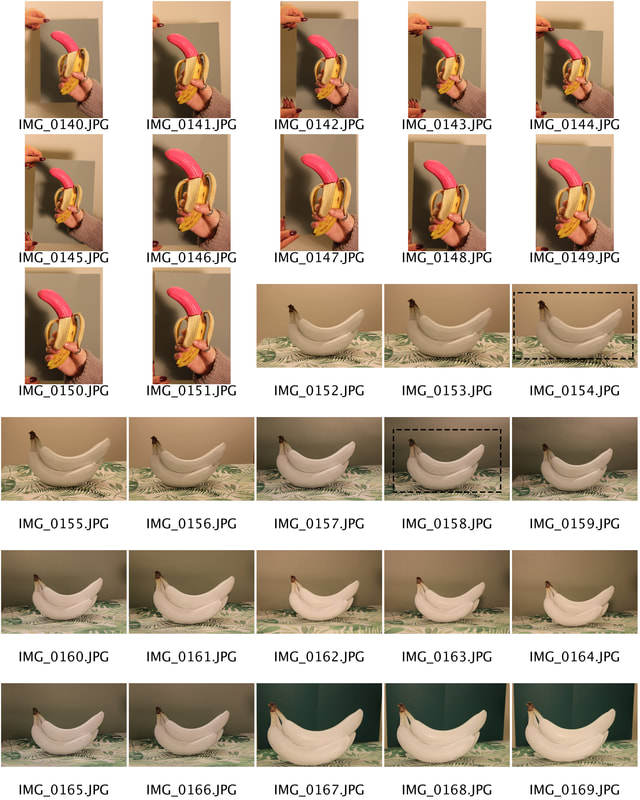
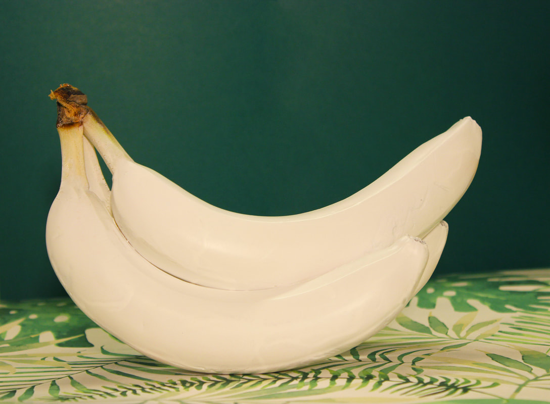
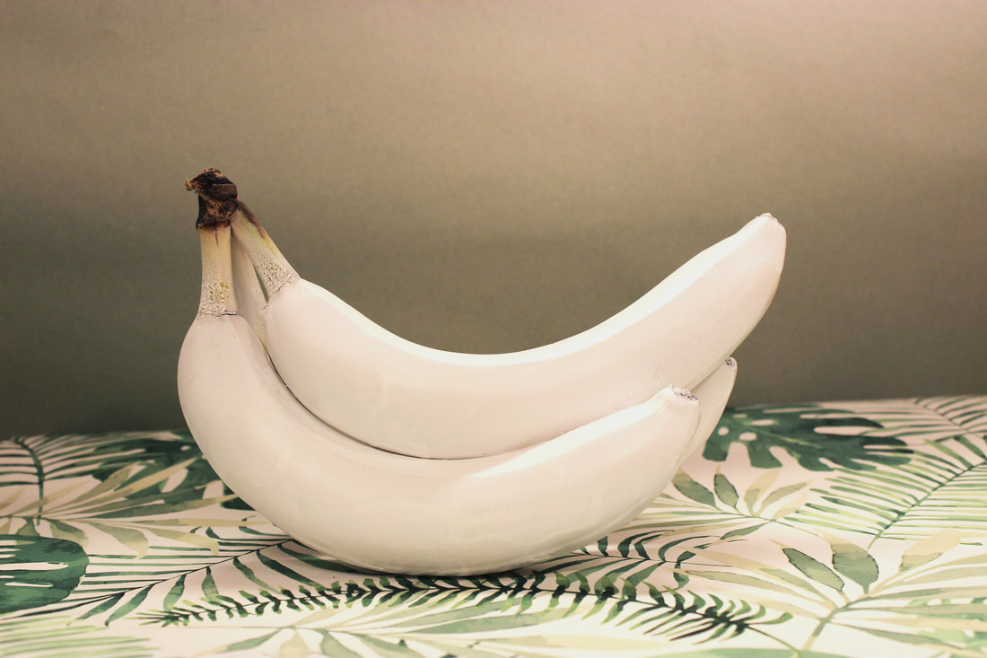
Final images.
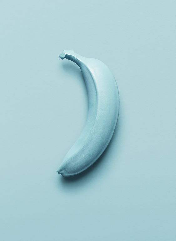
This was one of my favourite shoots to do and I am therefore super happy with the outcome. Every one of these images look professionally shot and edited, some of them go so far they look like porcelain and not real food.


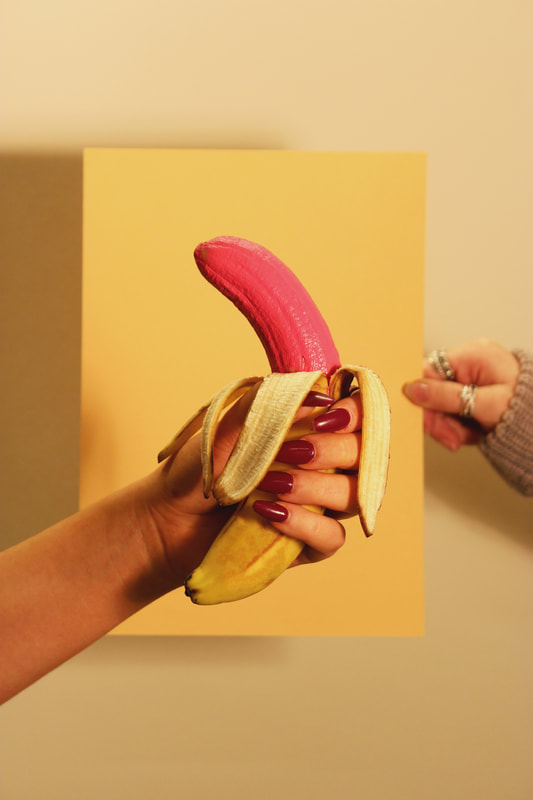
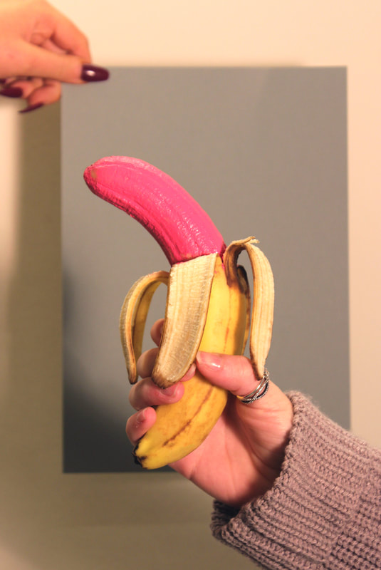
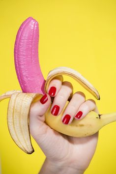
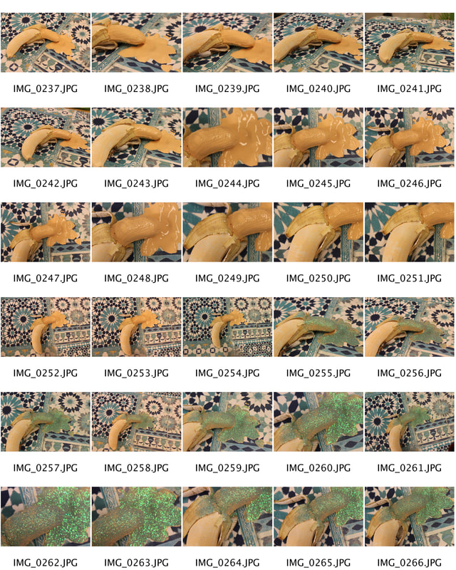
Development.
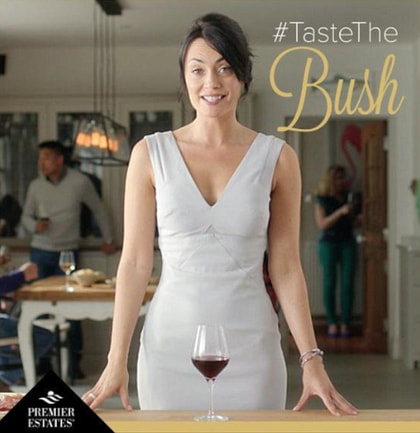
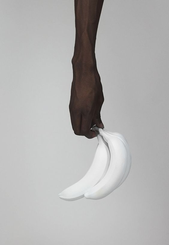
When I re-looked at these images I realised they didn't fit with the other ones. I think because I involved a hand/s into an image with a banana they started to look suggestive. This wasn't an intentional outcome however I do think they are rather funny once you notice this humour. Depending on who the advertising is aimed at I think sometimes you can entice an audience by using seductive humour. However, you would have to understand that it is very controversial and make sure you use it in the right way to get the correct message across. It would also have to be relevant to what you are advertising. Below is an advertisement by an Australian red wine company that created this suggestive image. Although the image is funny, it doesn't work because what they are trying to suggest and what they are promoting don't link, unless they were trying to say you can drink the wine to get into a women pants, which is rude and would offend many women, not selling the wine but driving customers away.