Cut fruit.
Fruit is a great place to start with advertising as it is brightly coloured and when the light shines on them it makes a buyer thirsty for flavoured ,zingy, fruit.
Shoot 1.
Inspiration.
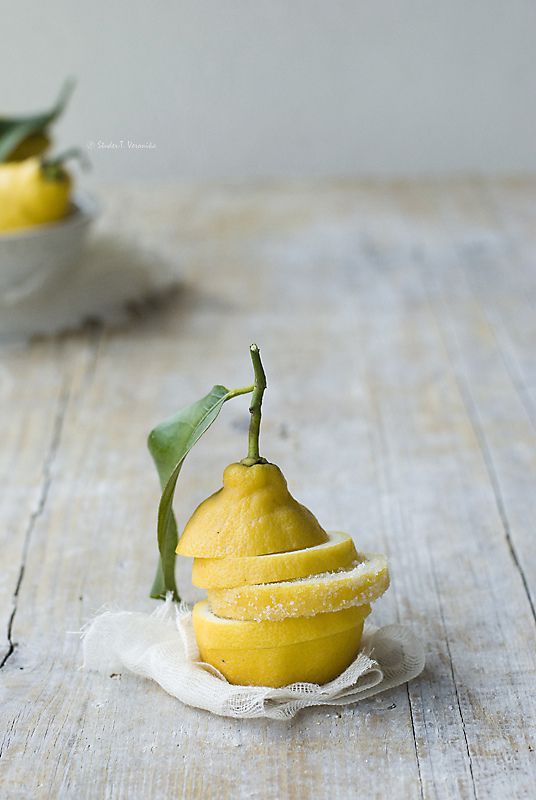
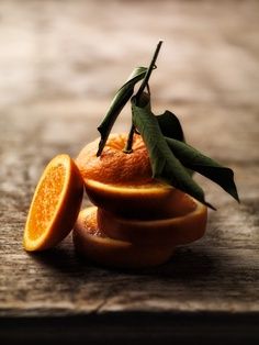
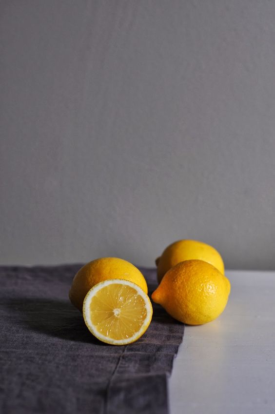
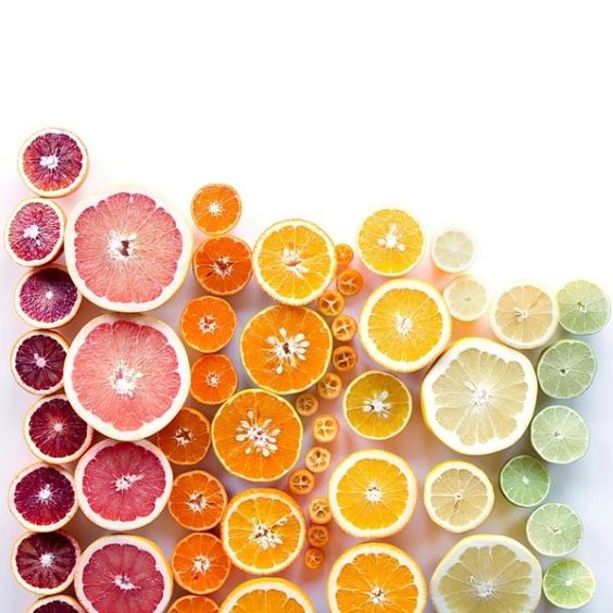
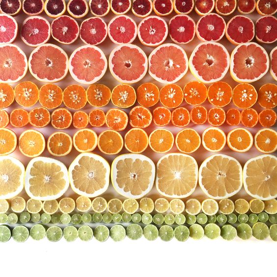
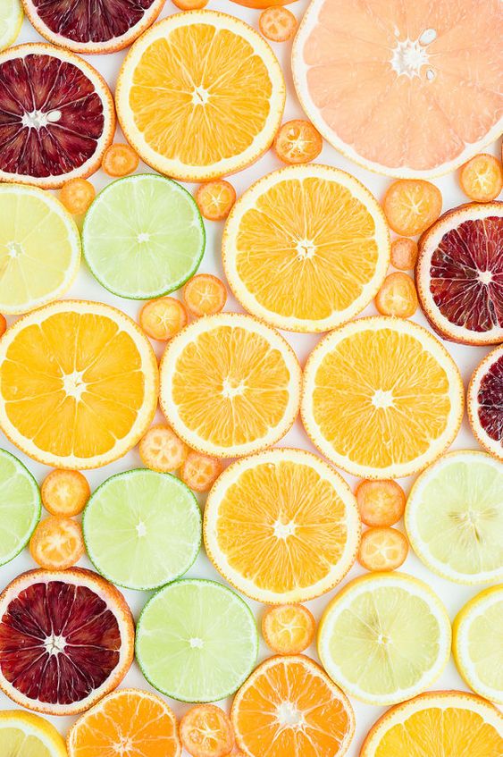
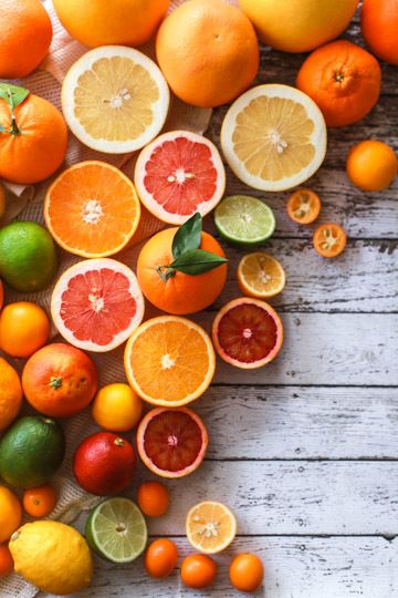
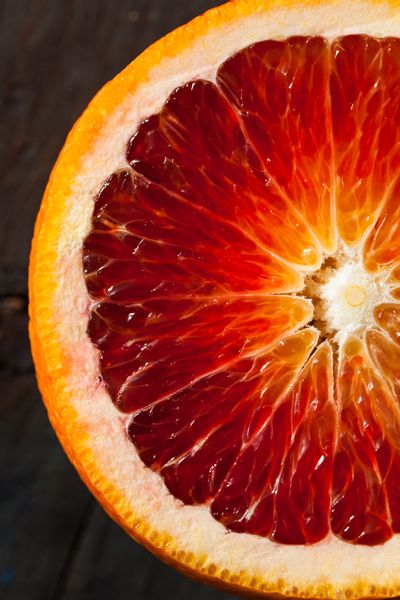
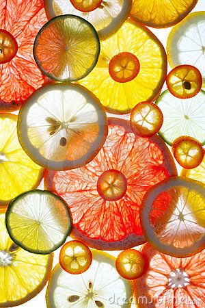

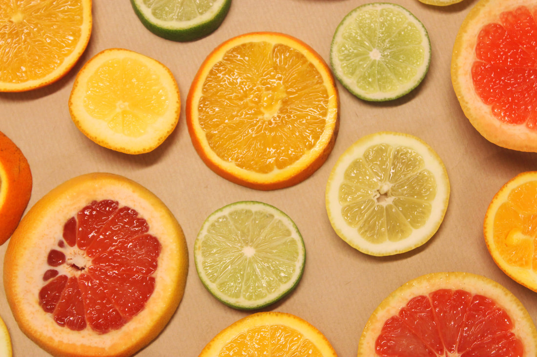
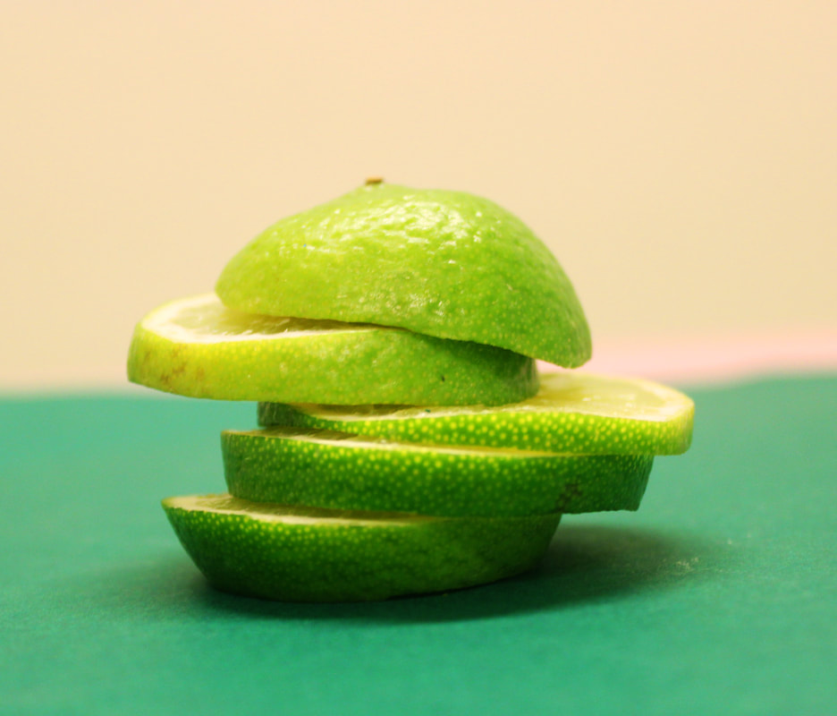
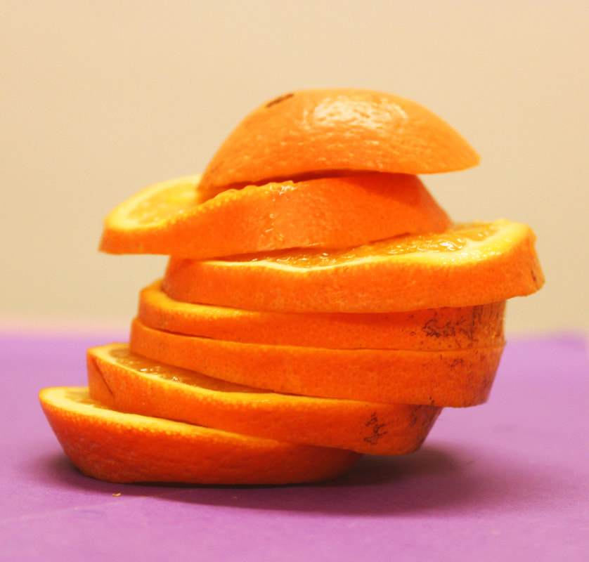
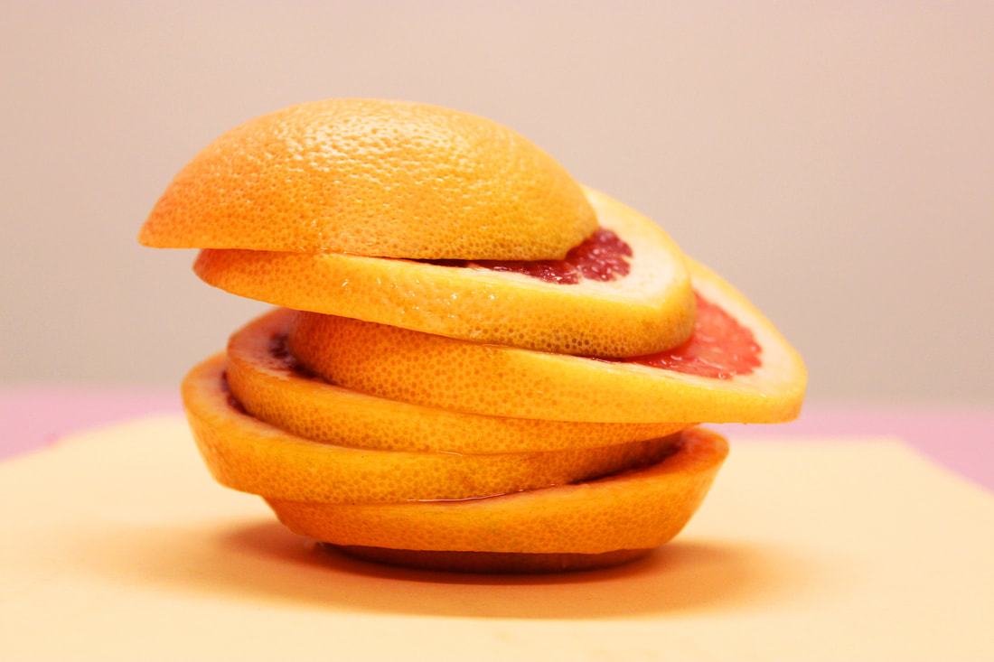
The inspiration I took for this shoot were the bright, vibrant colours that quenched my thirst. I love the composition of the first 3 images, cut and rearranged the fruit to its original shape. I love that you can see the vibrant colours but also the textures of the cut fruit. These images make you feel happy and thirsty, this is due to the colours and composition. Despite all being created by different artists, I think the reason behind these images being created is for advertising, commercials and also to buy in form of a print, or wallpaper.
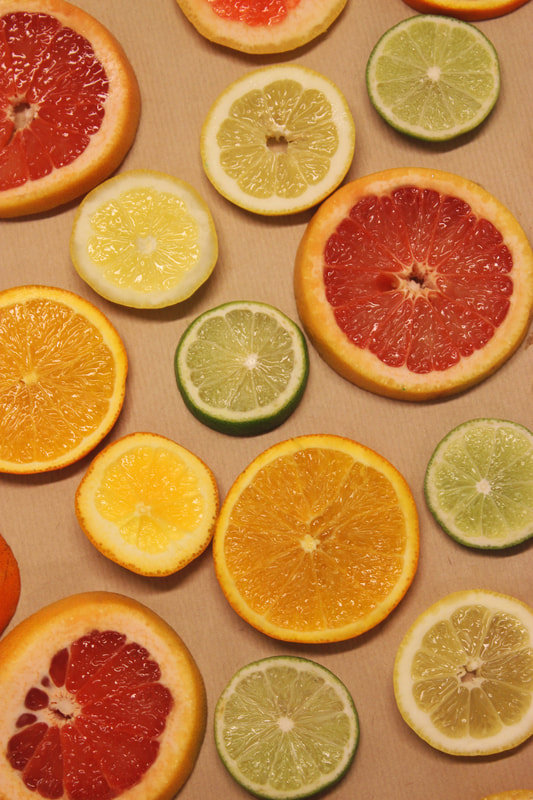
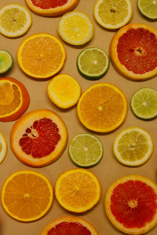
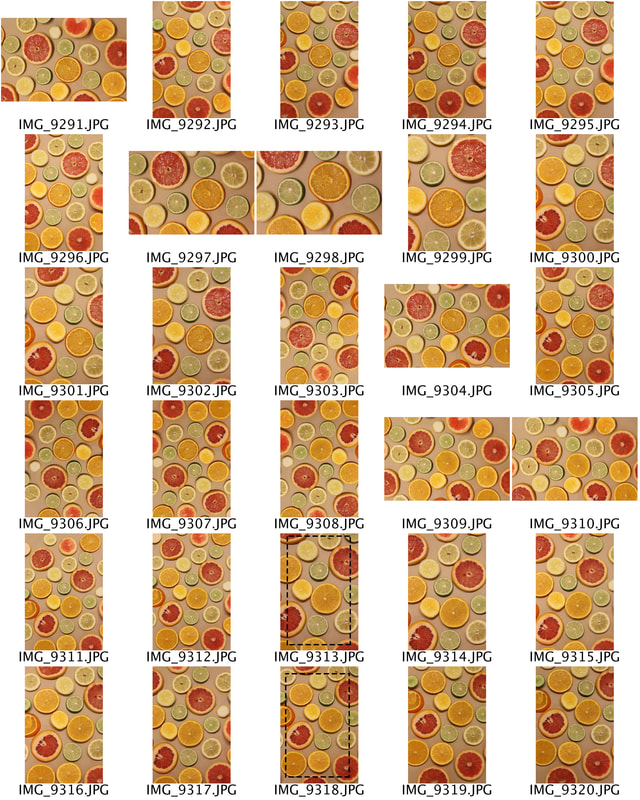
Contact sheets.
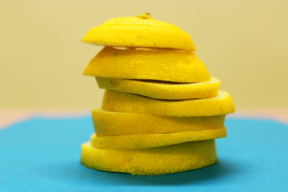
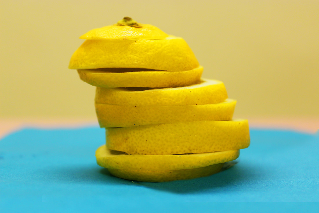
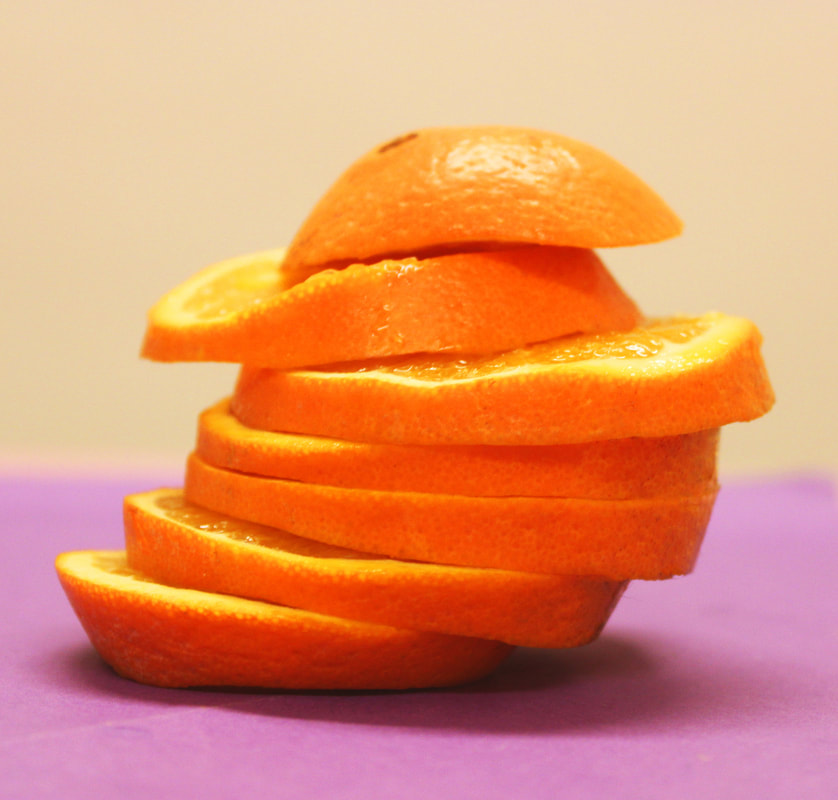
When doing this shoot there were parts I found difficult because the fruit was wet, so when I placed each piece I couldn't move it or you would be able to see it. This is the mistake I made on the first one, which was the lemon.

Extras.
With advertising photography it is very important to fix all final touches. I took the two images (beneath). I didn't like the one on the left because the shape of the lemon wasn't like the rest, as it was flat at the bottom. I didn't like the image on the right because of the wetness from the lemon looked messy and not appealing to an audience.
I edited the two images together to get rid of the wetness on the paper but still keep the nice rounded shape of the lemon.
I edited the two images together to get rid of the wetness on the paper but still keep the nice rounded shape of the lemon.

Edit images.
I liked that were consistence with shape between all four images . I changed the vibrance, saturation and brightness. The grapefruit is my favourite out of the four because the soft background contrasts well with the bright colour of the grapefruit. The colours in this image are all part of the same colour group and therefore work well together.


Final touches.
After the colour editing I did some final touches on the texture of the fruit. Using the 'patch' tool I got rid of the bruising and bits that weren't so attractive to an audience. This is what makes advertising photography, making sure everything is perfect. Selling a 'perfect' item is what you want as a seller but sometimes the only way to achieve this by editing as it is unrealistic.


Development.
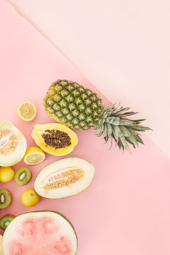
For development I layered the fruit out flat so you could see the shapes and colours of each fruit. The arrangement of different colours and sizes with similar shapes creates an image that is pleasing to the eye, making it great for advertising.