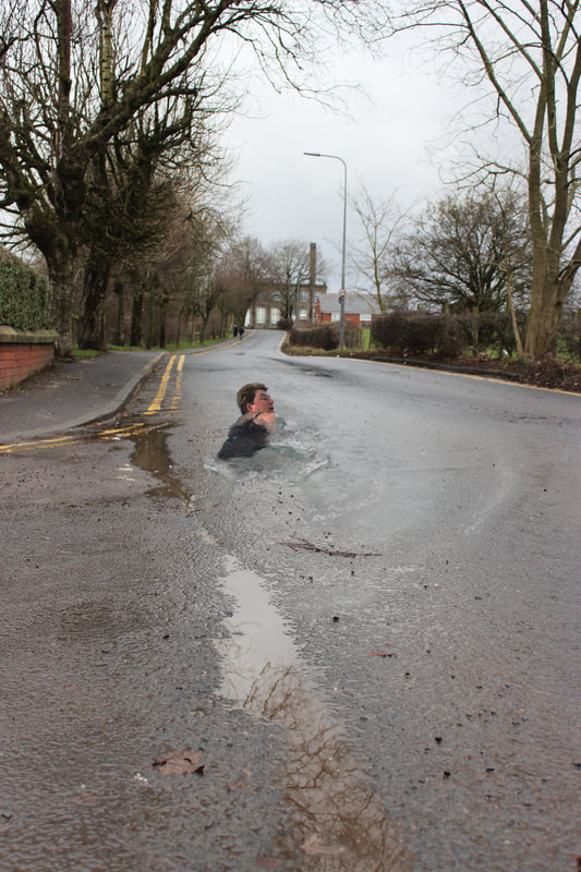
Letting Go
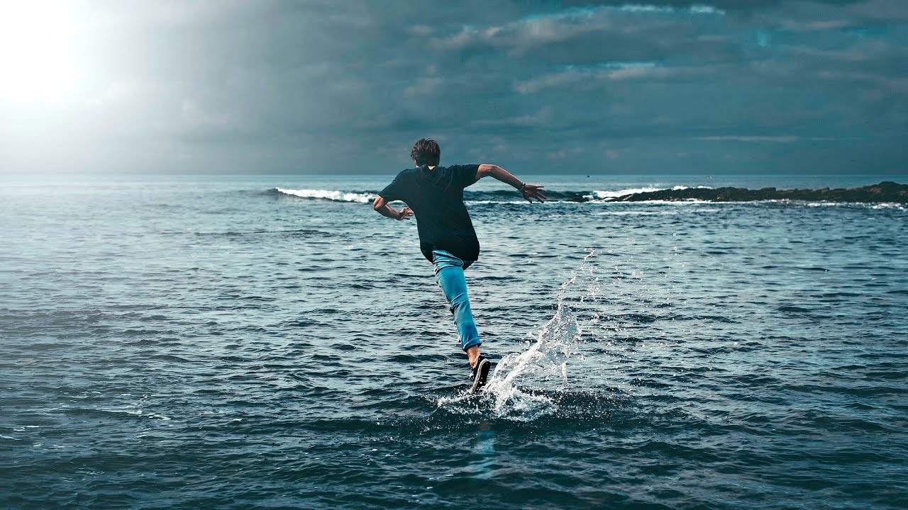
For us suffers with depression the urge to run away is a prominent side effect. Although the constant desire to escape is not ideal it can make us extremely motivated, as the want to get away and make life better for us provides the impetus to affect change in their life. The biggest way to begin to overcome depression is to accept the problem so you can start to let go. Holding on to pain doesn’t fix anything. Replaying the past over and over again doesn’t change it, and wishing things were different doesn’t make it so. In some cases, especially when it comes to the past, all we can do is accept whatever it is were holding on to and then let it go. That’s how everything changes. We have to let go of what is hurting us, even if it feels almost impossible. Deciding to hold on to the past will hold us back from creating a strong sense of self — a self that isn’t defined by our past, but rather by who you want to be. Oddly enough, painful feelings can be comfortable, especially if they’re all we know. We have trouble letting go of our pain or other unpleasant emotions about our past, because we think those feelings are part of our identity. In some ways, we may not know who we are without that pain. This makes it impossible for us to let go. The idea behind this shoot is that we would 'run on water,' literally, to get away, even if that place is only slightly better than the one were in now.
Shoot 2.
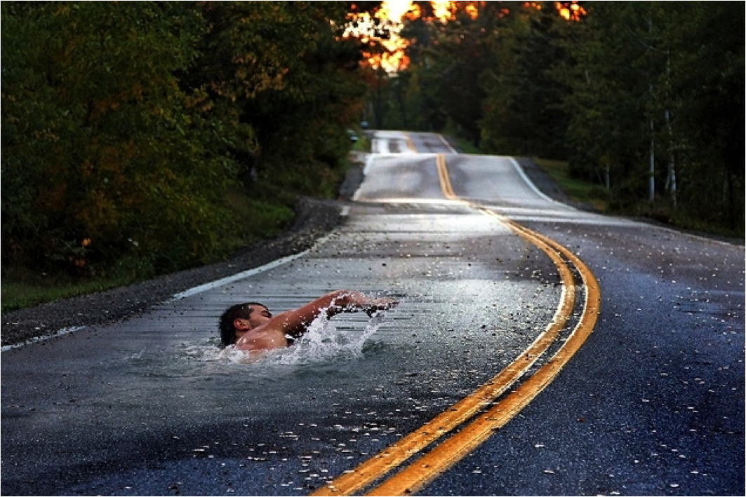
Erik Johansson and unknown artist.
Erik Johansson is an experimental artist who creates worlds of surrealist landscapes, making them seem as realistic as possible. To create work like his requires a lot of planning, hard work and most of all, dedication.
Johansson gives his work names that are not immediately obviously descriptive to the viewer. This forces people to read into his work and look more at the meaning and as to why he created the work, by questioning the title. Once people have looked at the image, then the title, and then back to the image, they will understand the image for what it really means, not just the dreamlike world people desire to visit because all is not what it seems.
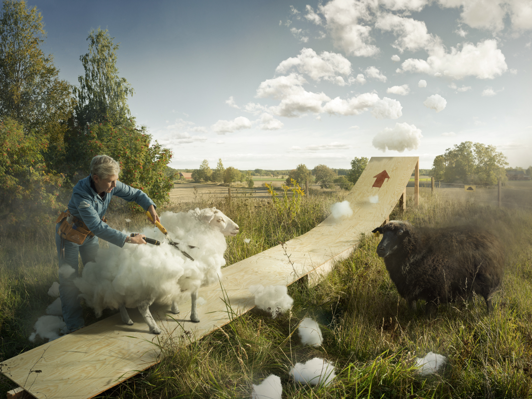
The colours used are all natural, down to earth colours with strong, warm tones. The colours are what you would expect to see in a dreamlike place, so bright blue sky, autumnal crisp leaves, clear blue waters and fresh green grass. The colours are what help the work seem so natural and realistic. The shapes in his work are the same, organic natural shapes, from the bend in a stone bridge, the movement of an arm, to the shape of a small round island. The shapes are realistic shapes that rely on stereotypes to get a natural, realistic feel. Johansson follows the rule of thirds in his work, which helps focus the viewer's eye where he wants it, to help get the reaction and feeling he wants.
In my opinion, the work should be displayed in high class galleries, not somewhere like a bus stop, because it wouldn't be appreciated by people walking down a street like it would be appreciated in a dedicated gallery. I also think that not everyone on the street will see the real meaning of the work, but in a gallery the titles of the particular image can be added, therefore making the meaning more obvious. The work should be displayed in two ways; either really tiny or really large. I think the images should be hung in collections, printed really small to force people to look closely into the images, and therefore seeing what the images really mean , not just the initial aesthetic. I also think they could be displayed large, like the wall paper in the room, allowing people to indulge themselves into the worlds, clearly seeing every part, even the bad bits.
Johansson's work is created with an intense around of planning. He starts off by sketching a rough copy of what he wants the image to look like, then he finds a location, all the required props and a model if needed. He then takes hundreds of images all for different angles, this means that when it comes to editing in photoshop he has every possible angle in order to make it as realistic as he can. When he edits the images he looks at every fine detail, manipulating and changing it until it is perfect before adding it to the final image. Here are some links to the videos he creates to show his editing process.
Johansson gives his work names that are not immediately obviously descriptive to the viewer. This forces people to read into his work and look more at the meaning and as to why he created the work, by questioning the title. Once people have looked at the image, then the title, and then back to the image, they will understand the image for what it really means, not just the dreamlike world people desire to visit because all is not what it seems.
The colours used are all natural, down to earth colours with strong, warm tones. The colours are what you would expect to see in a dreamlike place, so bright blue sky, autumnal crisp leaves, clear blue waters and fresh green grass. The colours are what help the work seem so natural and realistic. The shapes in his work are the same, organic natural shapes, from the bend in a stone bridge, the movement of an arm, to the shape of a small round island. The shapes are realistic shapes that rely on stereotypes to get a natural, realistic feel. Johansson follows the rule of thirds in his work, which helps focus the viewer's eye where he wants it, to help get the reaction and feeling he wants.
In my opinion, the work should be displayed in high class galleries, not somewhere like a bus stop, because it wouldn't be appreciated by people walking down a street like it would be appreciated in a dedicated gallery. I also think that not everyone on the street will see the real meaning of the work, but in a gallery the titles of the particular image can be added, therefore making the meaning more obvious. The work should be displayed in two ways; either really tiny or really large. I think the images should be hung in collections, printed really small to force people to look closely into the images, and therefore seeing what the images really mean , not just the initial aesthetic. I also think they could be displayed large, like the wall paper in the room, allowing people to indulge themselves into the worlds, clearly seeing every part, even the bad bits.
Johansson's work is created with an intense around of planning. He starts off by sketching a rough copy of what he wants the image to look like, then he finds a location, all the required props and a model if needed. He then takes hundreds of images all for different angles, this means that when it comes to editing in photoshop he has every possible angle in order to make it as realistic as he can. When he edits the images he looks at every fine detail, manipulating and changing it until it is perfect before adding it to the final image. Here are some links to the videos he creates to show his editing process.
|
|
|
|
Johansson's work makes me feel positive at first glance until I explore the image properly. Once I have looked closely at the image and looked at the title of the image, it gives a more of a negative tone, exposing how much we, as humans, ruin the planet. The warm tones and dream-like clouds throughout his work are used to play visual tricks on us because they are what we notice first, so we think positively until you look closer into the images. I think Johansson wants us to question our impact on the environment, and prove that the environment holds all the power we have. For example if you look at the image below on the left, the bridge is being held up by the walls at the side, the environment; if the 'environment' decides it doesn't wants to hold 'society' up any more, and even one wall falls slightly, there will no longer be a bridge, therefore no longer having a society. If you look at the second image below on the right, there is a blanket of dreamlike clouds, which completely covers the world below it leaving a magical dream-like world on top. If the blanket, an environmental factor, wasn't there the fantasy wouldn't be there.
Johansson's work links to modern day political awareness, that we should be more award of the graphical factors that us, as humans, we change. I think that Johansson wants people to be more aware of there surroundings. He could have also been inspired by fantasy/surrealism films like Baron Von Munchaussen, Wizard Of Oz or Alice and Wonderland.
Johansson's work links to modern day political awareness, that we should be more award of the graphical factors that us, as humans, we change. I think that Johansson wants people to be more aware of there surroundings. He could have also been inspired by fantasy/surrealism films like Baron Von Munchaussen, Wizard Of Oz or Alice and Wonderland.

Sample image.
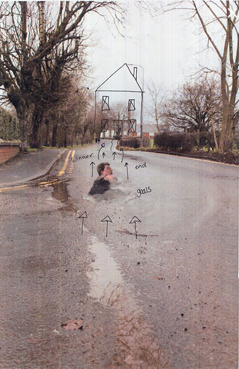
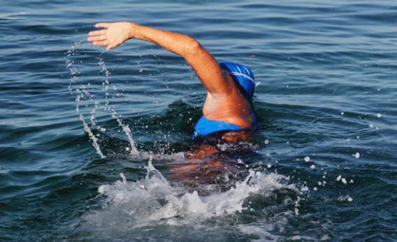
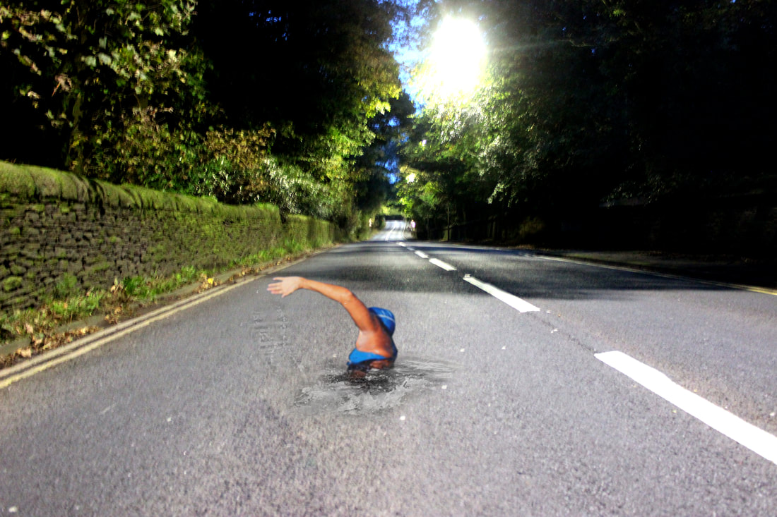
Before I went and did the shoot properly I tested out the technique and if it was possible for me to do this shoot. I took an image from google and took an image of a long road, I edited them together in Photoshop. I was happy with the outcome so I continued to do this shoot.

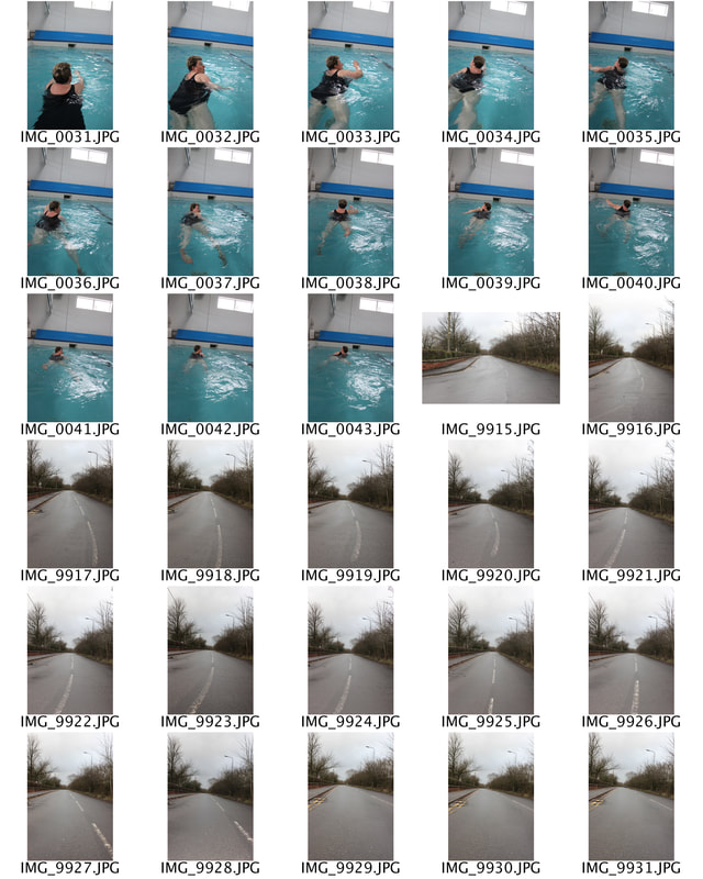
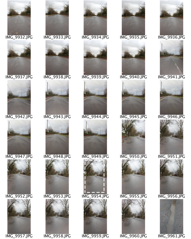
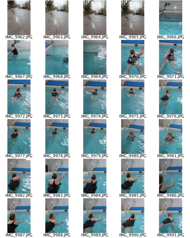
Contact sheets.
It was very important that I got the images right before I even thought about editing them together. They had to be of high quality, and have similar lighting so that the final images look realistic. I also made sure that I got images of some different splashes so I could edit them in around. I also tried to take picture of a rode that was already wet so that it was more effective when edited.

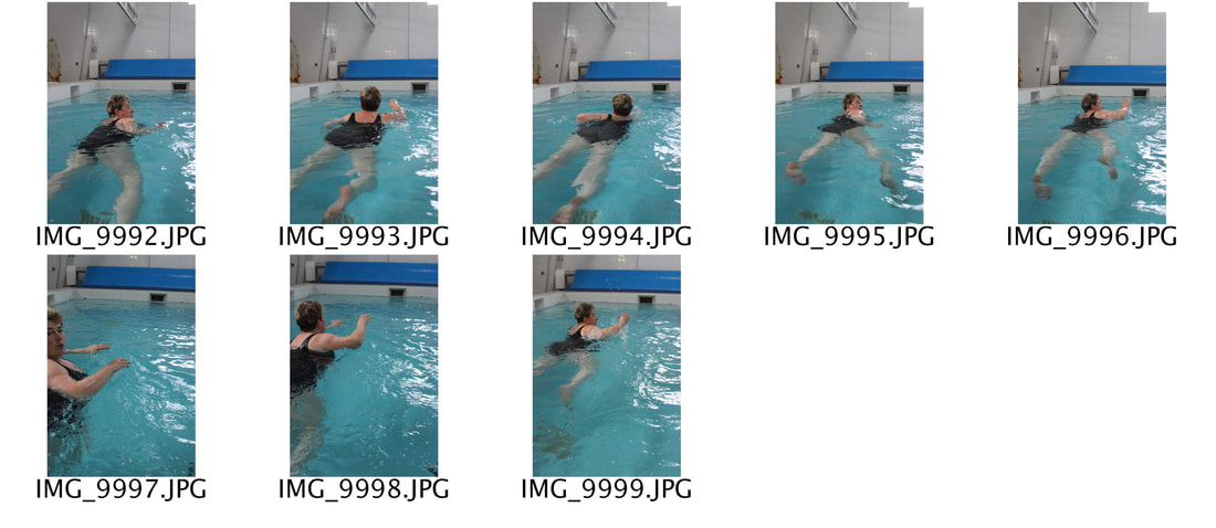
Final images.
I am happy with how these images turned out, I think if i was to do them again I would use a different person as the swimmer, but despite that I still think they look realistic especially the shape of the road.